
The Office of Sarah is a creative studio that works on branding, art direction, design, and illustration. Find us on Instagram.


Fun Fact #1
Sarah publishes to her blog haphazardly, and you can be the first to know!
Fun Fact #2
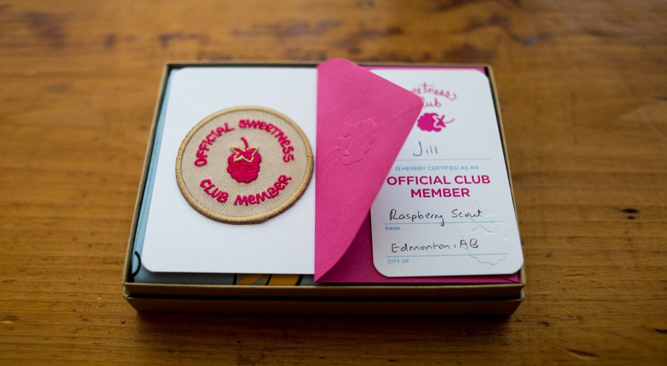
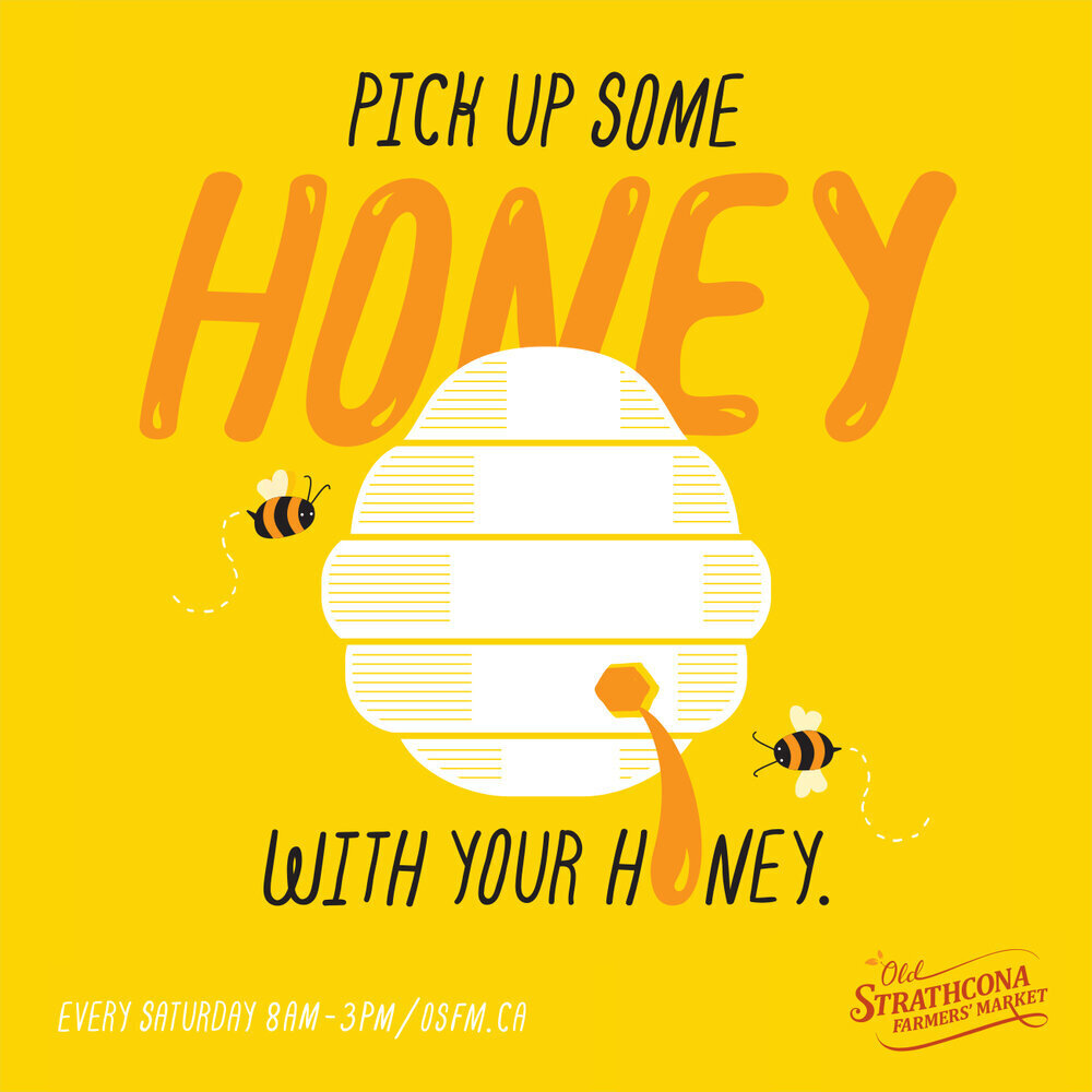
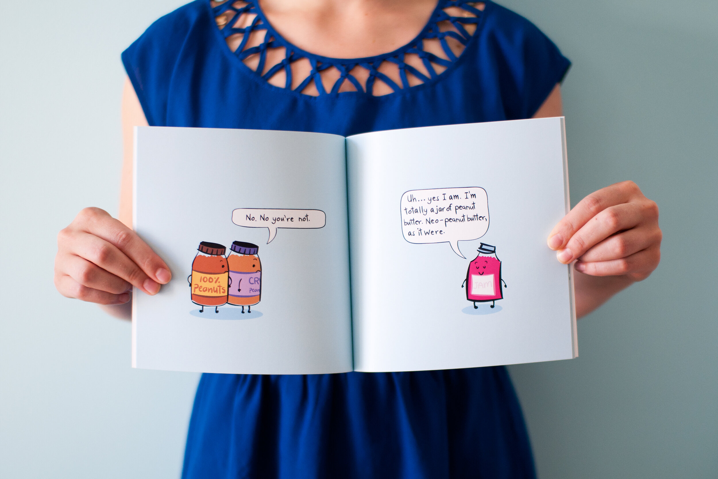
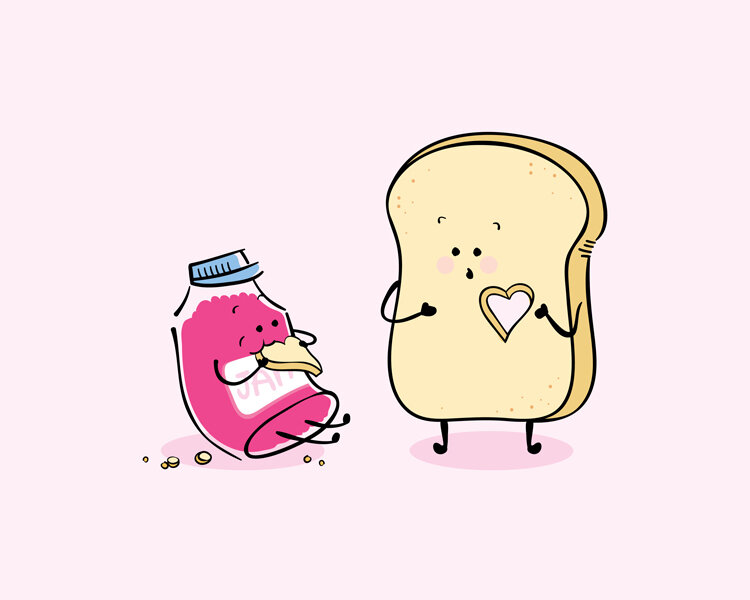
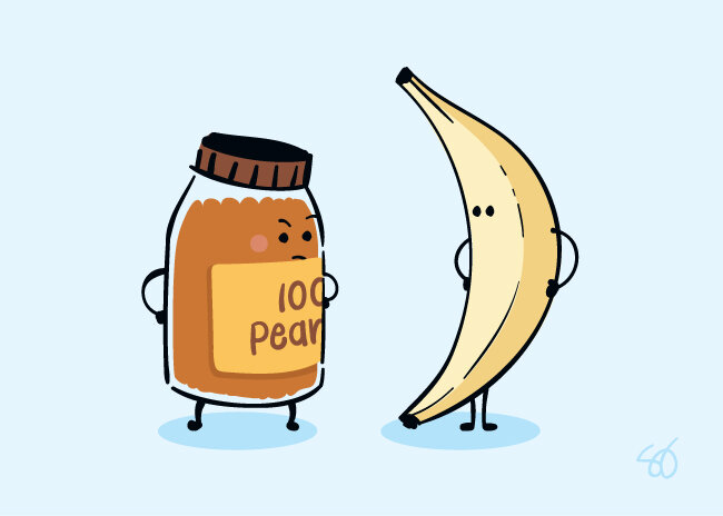
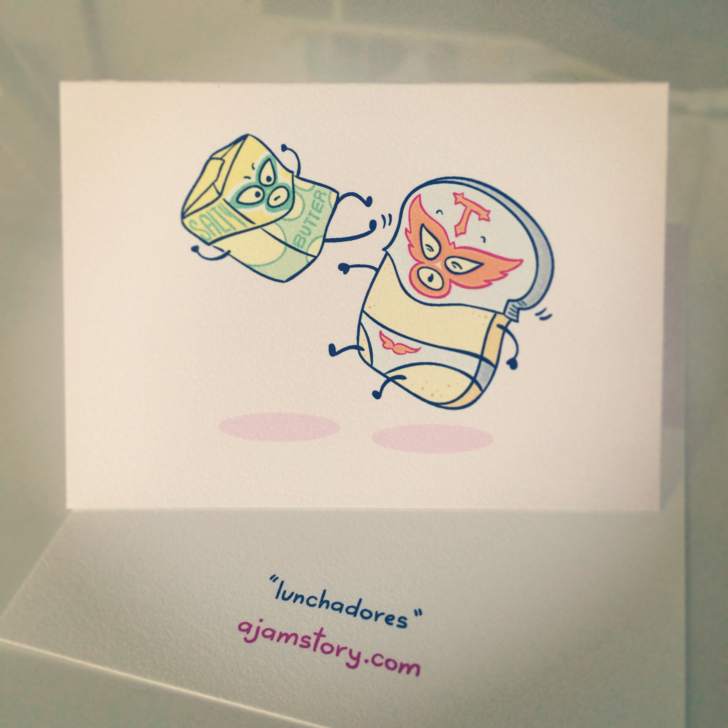
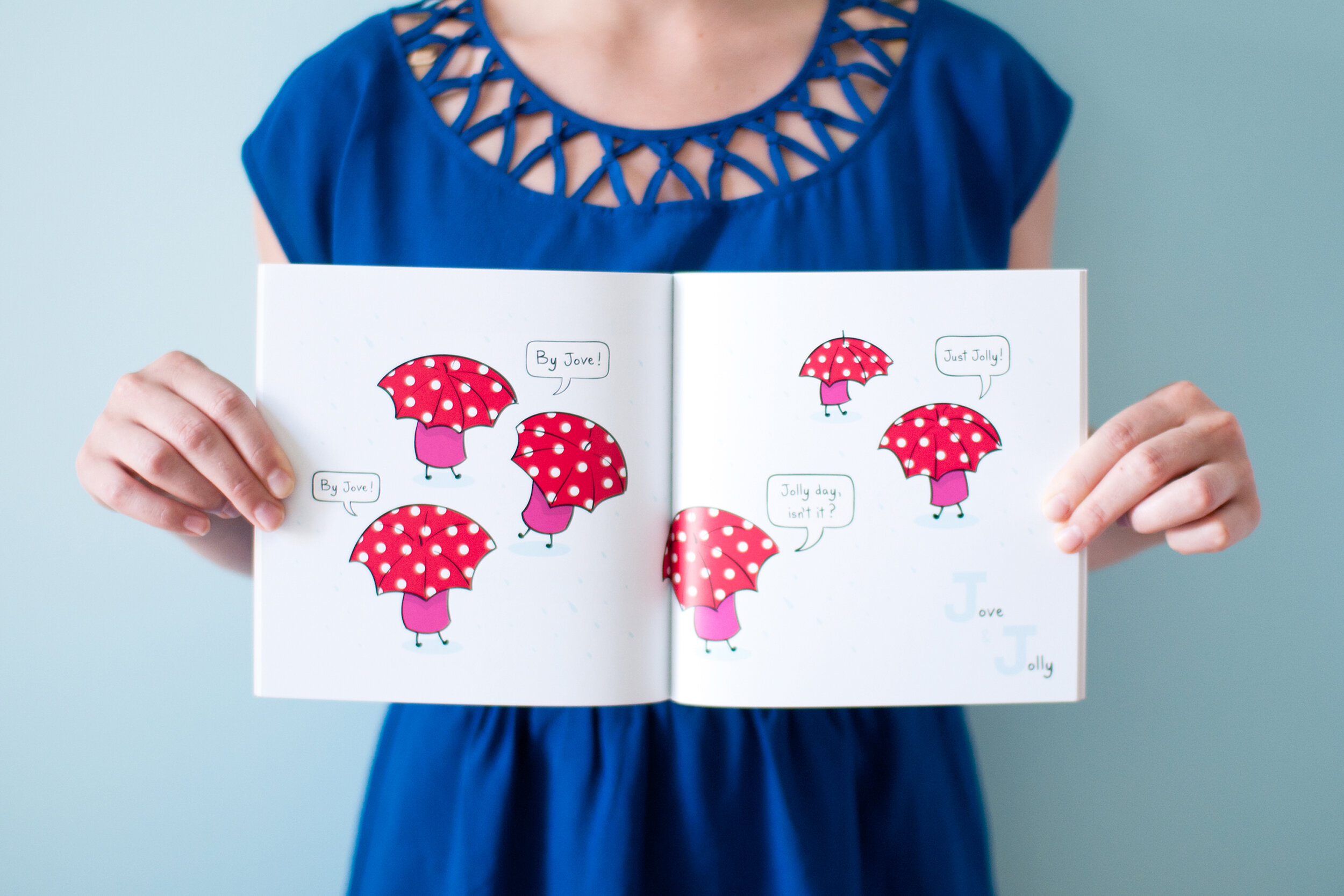
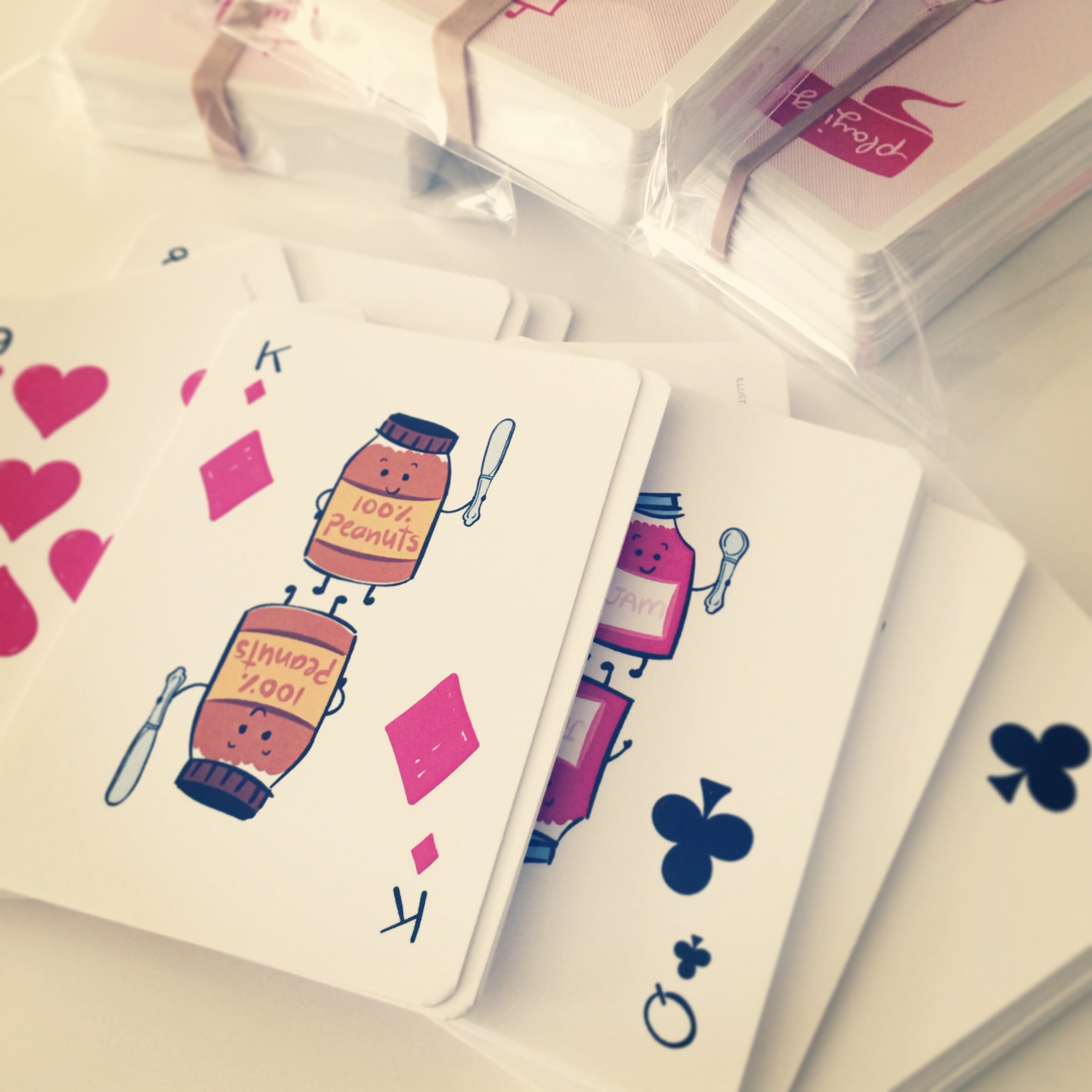
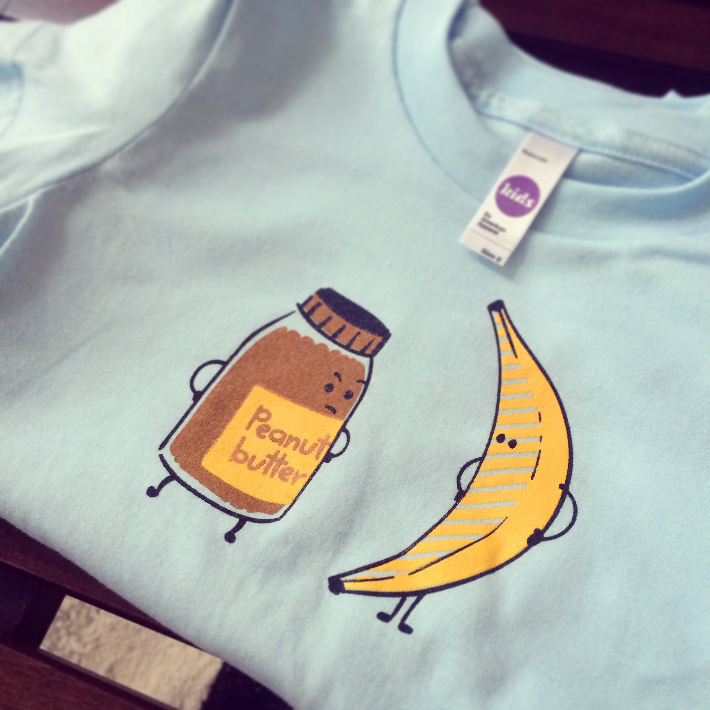
Sarah is the author and illustrator of several children’s books and products all about jam. Making this stuff was her jam for a few years.


Fun Fact #3
Sarah is a rare type of designer who enjoys being on stage.
She has presented twice at The Telus World of Science: Dark Matters (2021 & 2019), MacEwan Entrepreneurs Organization’s Women in Entrepreneurship Symposium (2020), Orange: The Design Conference (2019), Nerd Nite Edmonton (2018), BurlyCon (2018), Conference of the Universities Art Association of Canada (2017), DPM Edmonton Meetup (2017), amongst others. She likes giving presentations and building gorgeous slide decks, send her a message if you’re interested in having her talk at your event!
Fun Fact #4
Sarah was one of the top 3 ranked Amateur Salsa dancers in North America between 2015-2017.

Maria Acosta-Cevallos & Sarah Jackson competing at the 2016 World Salsa Summit, Pro-Am Female Salsa On 2 Showcase / Image description: repeating GIF of Sarah spinning and then landing in a pose on her knee, with Mario catching her arm